"Hiloofnikim" is an app that allows the students in HIT institute to find a design academy for the student exchange program. With the app, the students can filter schools by different categories, compare, consulting with others, and eventually apply to the program.
_ _ _ _ _ _ _
Overview
In the third of the design degree year out of 4, many students participating in the student exchange program. To do so, the application process is performed in the prior year.
The problem
There is no one particular source that includes all the relevant information, which makes it harder to conclude what is the institute that matches the most. The sources of information are scattered, therefore it takes time to gather it - such as which institutes are included, reviews ,and basic information about the process.
The solution :
I designed an app that allows the student to find an institute for the exchanging program.
Academies Screens - Through the menu below, you can access the screen where all the institutions are displayed. You can filter between the different institutions by the user's preferences. As a user, you can filtrate academies by their popularity (rating, number of visitors, etc), their location, cost of living, and the attractions that the place has to offer.
courses - On the screen that shows all the courses, you can search for certain courses, see where they are taught, how many people learned the course, and reviews.
The home page - This screen varies depending on the student's progress in the exchange process. The instructions about each step are given at the beginning of the home page, and it will always show the user his current step and what actions are necessary to Move forward in the process.
The home page will show different things to students who are at different stages in the process. For example, a student who is in the institution selection stage will see on the home page recommendations for institutions, while a student who is about to go abroad will see frequently asked questions and a list of people who were in the institution before him.
The home page will show different things to students who are at different stages in the process. For example, a student who is in the institution selection stage will see on the home page recommendations for institutions, while a student who is about to go abroad will see frequently asked questions and a list of people who were in the institution before him.
An institute profile - Contains necessary information about the Academy.
The “favorites” section is located in the menu bar. Institutions can be saved as favorites, and be compared.
Providing information -The student returning from the exchange program has an important role - to provide information about the experience. Besides, there is a forum where users can ask and answer questions. The user receives alerts when: New questions are asked, and for answers to questions that were asked by the user.
Onboarding - In the onboarding screens the student can view an introduction that summerise the stages of the application process. Afterward, the user can fill up the necessary details to enroll.
_ _ _ _ _ _ _
The Process
Survey conducting
As a student that has gone through the research that is necessary to determine what is the suitable destination to exchange, I had my initial assumptions as a starting point.
In the survey, my goals were:
➊
Learn about my target audience and To be aware of the pain points.
➋
Classify the criteria for choosing an academy abroad.
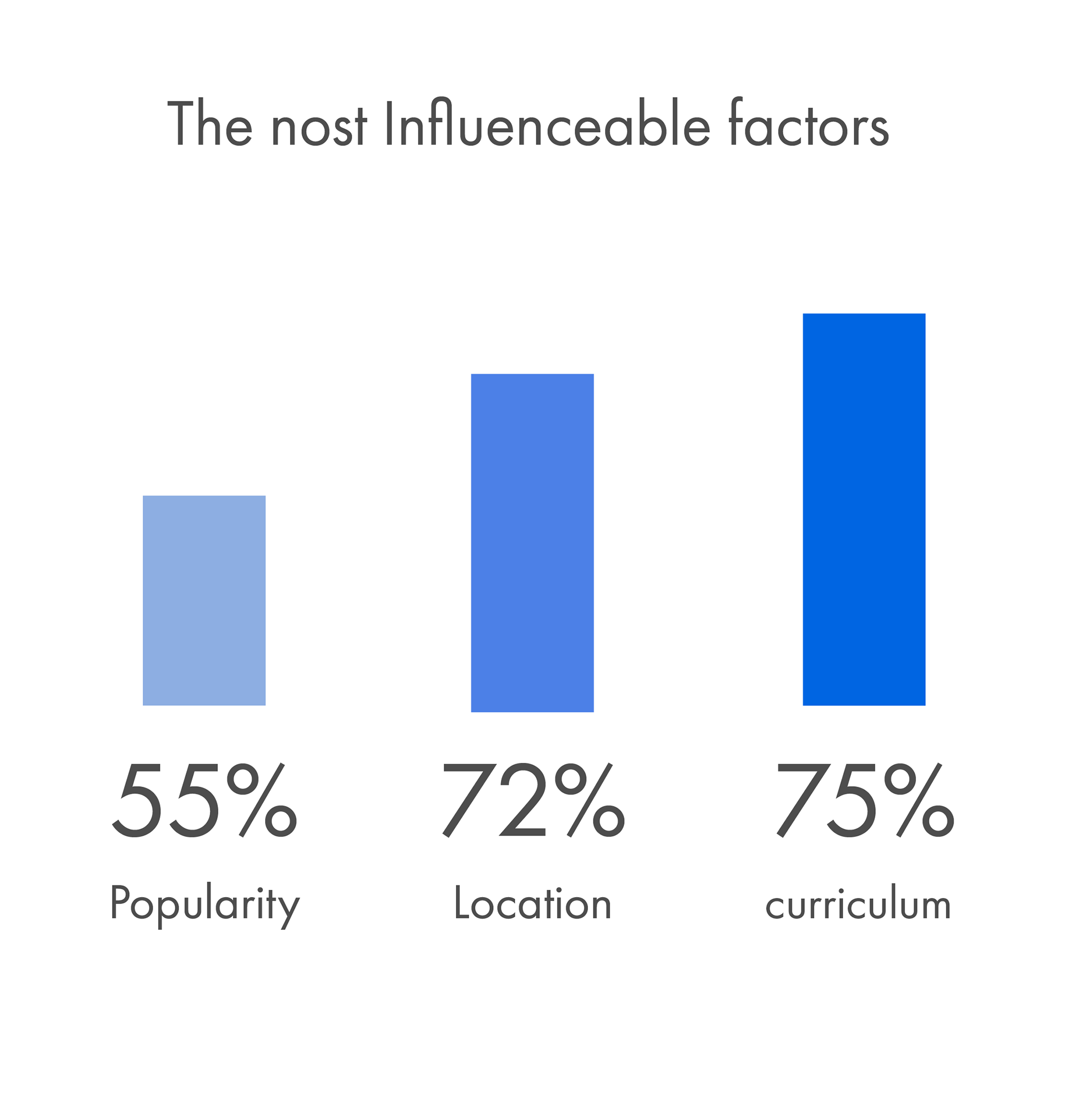
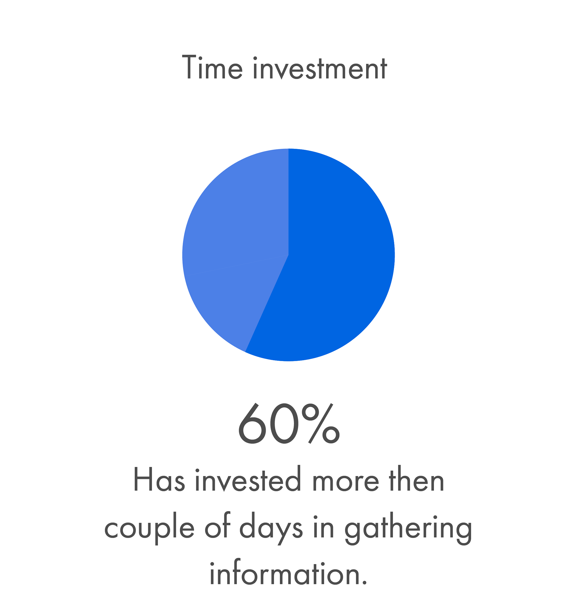
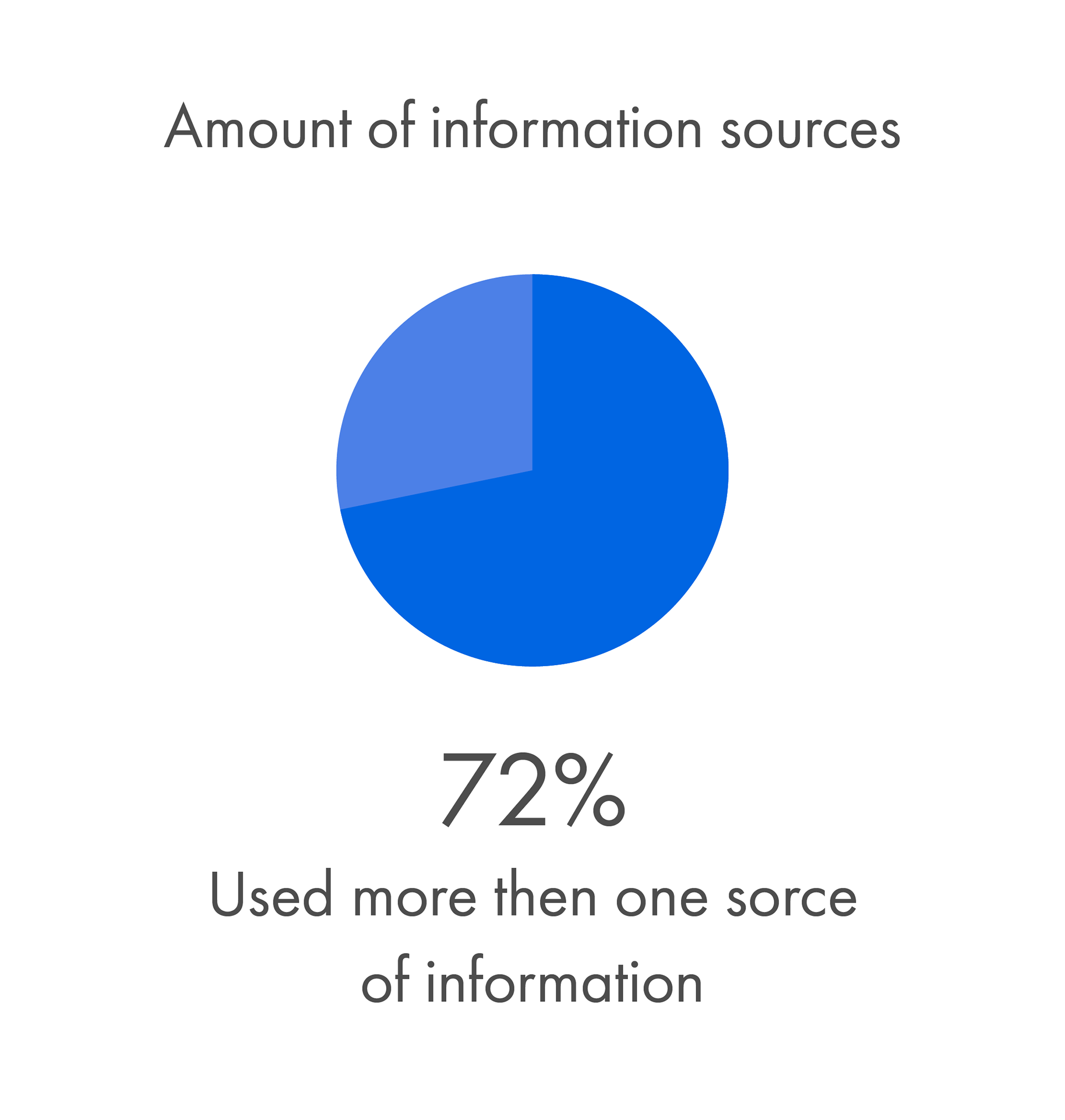
Survey results


_ _ _ _ _ _ _
Personas
Based on in-depth interviews, I have created 4 personas that represent different values. Each persona has a name, age, interests, financial status, their main usage of digital platforms, etc. This is a short representation of my research:
_ _ _ _ _ _ _
Wireframes
By defining the features that are necessary for the app to function, i was able to site map that shows the overview of the flow- sections, information, and the navigation inside the app. Here you can see the screens that allows the user to filter the academies by different categories.
_ _ _ _ _ _ _
Colors and fonts
I wanted to achieve a clean and coherent design but still up to date. The pallet is combined with cold colors that resemble the open sky, and pink shade that resembles an optimistic approach.
_ _ _ _ _ _ _